

Love at First Click? Not Really – When UX Hurts and Sends Customers Away
The internet is drowning in content. We’re overstimulated, overwhelmed, and exhausted by it all. SEO and SEM decide whether we’ll even click. UX decides if we’ll stay - or slam the door in three seconds flat.
How much time do you get to make a great first impression? Offline, maybe 7 - 11 seconds (all senses engaged). Online? A brutal 3 seconds. 1, 2, 3 – I click – I scroll – I buy – I comment… or I leave and never come back.
You can debate whether SEO is dead or alive until it becomes a philosophy class. But UX? That’s where reality hits hard. Because everything boils down to one simple rule: content and products are made for people. And with poor UX, there’s no relationship. Not even a second date.
Photo by Rafael Otaki on Unsplash
My personal list of UX sins that hurt more than stubbing your toe
1. Pop-up Hell – five windows before you see the page
Cookies. Newsletter. First-time discount. Urgent flash sale. Upsell. Chatbot. Review request. By the time you’ve closed them all, you’ve forgotten why you came here in the first place. The only goal achieved? An annoyed user who’s already gone.
2. Bla, bla, bla with the bot
AI is part of our reality - whether we like it or not. More and more companies throw their entire customer support onto “super-smart” chatbots that jump out the moment you accept cookies.
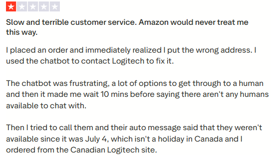
In theory, fine. In practice, a nightmare if that’s the only way to get help. No phone, no email, just endless FAQ pages and a chat that loops like Groundhog Day. My favorite example? Logitech. Great gear. Terrible UX: from buying, to returns, to customer service.
3. Let’s play… Autoplay!
You land on a site and boom - something starts blaring out of nowhere. Shock, panic, frantic search for the mute button. And yes, it’s 2025 and this is still a thing. Video can enrich a website, sure. But autoplay? That’s a crime against users, committed with full intent.
4. The Wall of Text
Scroll. Scroll. Scroll. Still scrolling. Nothing kills curiosity faster than endless blocks of text without headings, breaks, or structure. Imagine reading a novel with no chapters. Even if the story is good - you’ll probably give up halfway through. I see this a lot in SaaS startups: brilliant knowledge, dumped on the page like movie end credits. The result? Nobody knows what it was about. Not even Google.
5. Slow as a Snail
We like things fast: express shipping, instant streaming, next-day delivery. A website that crawls at turtle speed feels shady. It’s like a regional train - you’re not sure if it will ever get there. Spoiler: the customer won’t wait to find out.
Bad UX - slow website
6. Mobile, what mobile?
A beautiful desktop site that turns into a jigsaw puzzle on your phone. And since most traffic today is mobile, a site without responsiveness might as well not exist.
7. Creativity on a High
Everyone wants to stand out. That’s good - when it’s coherent and well thought out. But when menus hide in odd places, icons have no labels, and “My Treasures” replaces “Cart,” it stops being creative. It’s just confusing. Creativity won the battle, UX lost the war.
8. Forms as Punishment
Still here? Then fill out this form as penance. Twenty required fields, a CAPTCHA with buses and hydrants, maybe a math riddle. And at the end? “Something went wrong.” User turns red with rage, swears under their breath, closes the page. And buys somewhere else.

Wrap-up
In marketing and copywriting, there are endless ways to create a “wow.” In UX, the real magic happens when it feels simple, seamless, almost invisible.
Rule number one: don’t annoy the user.
Make your site intuitive, let people navigate without guessing, find info in seconds, buy in clicks, and fill out forms in less than a breath. Because even the prettiest design won’t save a business. When UX hurts - customers leave. And they don’t come back.
Is your website guilty of these UX sins? Let’s fix it. Get in touch and I’ll help you turn frustration into a seamless experience your customers will love.