

Why Users Don’t Read - and How to Use It in UX Writing

People don’t read your website. They scan it, scroll, skip, and glance - hunting for the one line that matters right now. Like a barista pulling the first espresso shot: fast, focused, no unnecessary foam.
And that’s perfectly fine. Because once you understand how users scan, you can design copy that guides their eyes exactly where you want them to go.
According to the Nielsen Norman Group, users read only 20-28% of the words on a typical webpage. That means your content strategy should be built around readability, not volume.
Let’s see how to make that happen - with research, real e-commerce examples, and a few UXpresso-flavored twists.
1. People Don’t Read - They Scan (and That’s Not Laziness)
Scanning isn’t a sign of short attention spans - it’s a survival mechanism. Faced with too much information, users’ brains switch into “pattern-detection mode.”
Jakob Nielsen’s famous eye-tracking studies show that people focus on:
Headlines and first lines of text,
Numbers, links, and CTAs,
Visually distinct elements (like bold text or buttons).
Everything else? Skipped. So instead of writing long intros, ask yourself:
“What can I say in three seconds that makes someone care enough to keep reading?”
That’s your golden rule for UX writing.
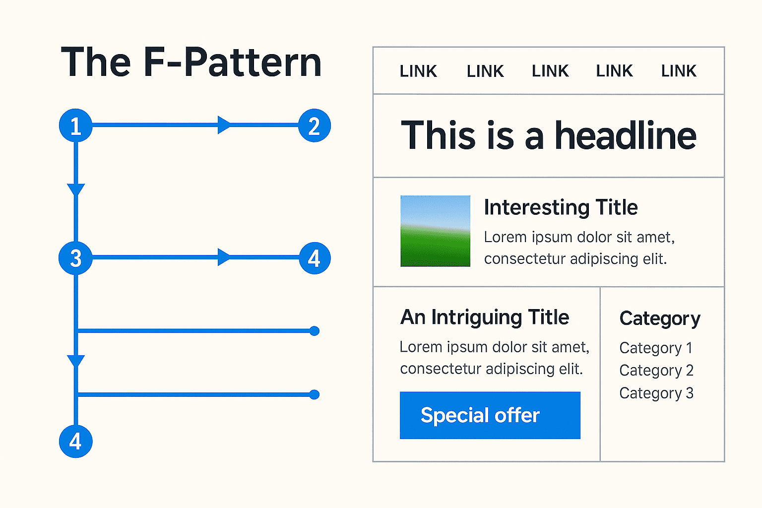
2. The F-Pattern and Z-Pattern: How Eyes Really Move
The F-Pattern
Eyetracking studies reveal that users read:
A full horizontal line at the top,
A shorter one below,
Then skim vertically down the left edge - forming an “F.”
💡 For copywriters and designers:
Put critical information at the start of lines and paragraphs.
Use subheadings and bullet lists to support scanning.
Keep CTAs visible - not buried in text blocks.
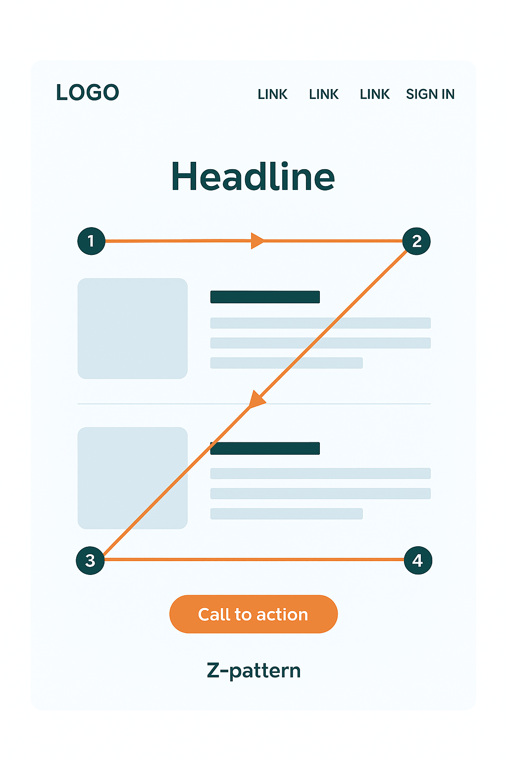
The Z-Pattern
Used for clean, visual layouts like landing pages or product sites. Users move in a Z-shaped path: top left → top right → bottom left → bottom right.
💡 Best practices:
Top left: your brand or logo
Top right: navigation or offer
Center: value proposition
Bottom right: final CTA
Think Shopify’s homepage - bold statement, clean layout, perfectly placed button.
3. Microcopy: Small Words, Massive Impact
Microcopy is the short, invisible text that guides users through critical actions - buttons, placeholders, form labels, tooltips, confirmation messages.
Why it matters? Because when users stop reading and start doing, microcopy is the only text that still speaks to them.
Examples:
“Sign up” - “Create your free account in 1 minute.”
“Buy now” - “Add to cart - free shipping over $99.”
“Error” - “Oops! Your password needs one more character.”
According to CXL, improving button and tooltip microcopy increased conversions by 17%, and adding trust statements (“No hidden fees”) raised checkout conversions by 11%.
Tiny words = huge results.
4. Real-World Examples from E-Commerce and SaaS
🧾 Checkout Flow
Old version: vague button labels like “Submit.”
New version: “Pay securely and start today.”
Clarity reduces hesitation - conversions go up.
💻 SaaS Landing Page
Z-pattern in action:
Top left - logo.
Middle - strong value prop: “Triple your leads in 30 days.”
Bottom right - CTA: “Try for free.”
Users don’t need to read everything; they get it at a glance.
🛒 Product Page
Microcopy like “Free returns within 30 days” or “Only 3 left in stock” works because it fits scanning behavior: quick information = instant trust.
According to ConvertCart, improving readability and layout on e-commerce pages boosted usability by 124%.
5. Writing for Scanners: 5 Espresso-Smart Rules
Front-load key info.
Lead with the main point. Don’t warm up - just serve the shot.Use meaningful subheads.
“Our Services” - boring.
“How We Doubled a Client’s Sales in 8 Weeks” - engaging.Break it into bullets.
Blocks of text are walls. Bullets are open doors.Optimize your microcopy.
Every label and button is a conversation with the user.
“Start free trial” beats “Submit” every time.Design with words, not after.
UX writing is architecture - not garnish.
Work with your designer so your words align with natural eye movement.
6. Keep It Real: What the Data Actually Says
The F-pattern isn’t universal - mobile users scan in irregular zigzags.
Clever microcopy fails if the UX behind it is confusing.
Pushy CTAs (“BUY NOW!!!”) reduce trust - authenticity sells better.
The average user decides within 10 seconds if a page is worth staying on.
That’s your entire window to make an impression.
7. The Espresso Takeaway
Users don’t read and that’s great news, because you can now design for how they actually behave. Good UX writing is about strategic words - placed where scanning eyes will find them.
Quick action plan for today:
Choose one page - blog, product, or landing.
Check the first three lines: do they show the main benefit?
Audit all your buttons and forms - is the next step clear?
Add one bullet list where your text feels heavy.
Track time-on-page and CTA clicks before/after.
Do it like brewing espresso: precise, consistent, human.
If you suspect your users read your site the way you read Terms & Conditions… It’s time for a UX content check-up. I can help you fix that.